
Pantone Color of the Year 2026: How to Use Cloud Dancer in Your Products
Unlock serenity, versatility, and market relevance with PANTONE 11-4201 Cloud Dancer
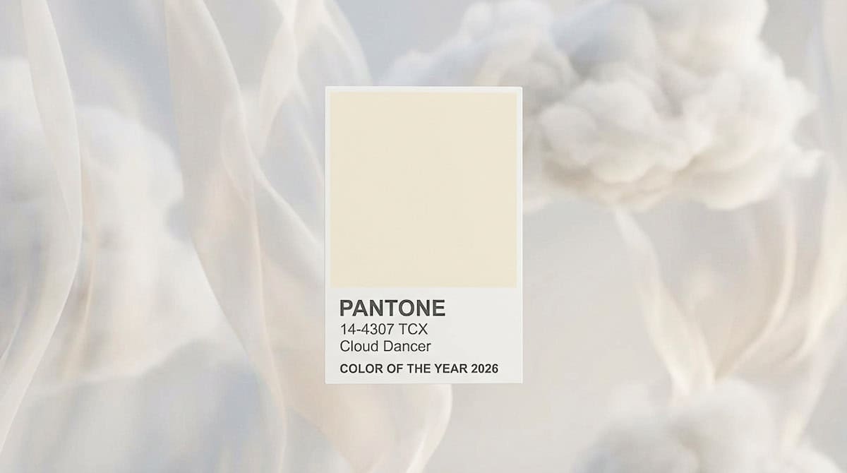
In 2026, Pantone made a bold yet subtle statement by naming Cloud Dancer (PANTONE 11-4201) as its Color of the Year, a soft, airy off-white that stands apart from previous vibrant choices and champions clarity, calm, and creative space.
As a neutral with both warm and cool undertones, Cloud Dancer functions as both an expressive design asset and a flexible foundation for product innovation across industries, from fashion and interiors to tech accessories and branding.
What Cloud Dancer Means for 2026 Trends
Cloud Dancer represents more than an aesthetic: it reflects cultural yearnings for simplicity in a fast-paced world. Pantone’s Color of the Year initiative, established in 1999 to capture the global mood via color forecasting, selected this nearly white hue to evoke renewal and minimal visual clutter.
For creatives and product teams, this signals a major opportunity: incorporate Cloud Dancer into offerings to align with market sentiment and drive trend-centric engagement.

Top Ways to Use Cloud Dancer in Your Products
1. Fashion & Apparel
Integrate Cloud Dancer into seasonal collections as an anchor neutral:
- Capsule pieces: T-shirts, knitwear, and tailored basics benefit from the calming neutrality.
- Layering staples: Outerwear and scarves in Cloud Dancer add elevated simplicity that complements rich textures and patterns.
This minimalist approach resonates with broader fashion trends emphasizing clean silhouettes and timeless elegance.
2. Home & Interior Products
Cloud Dancer shines in design contexts that emphasize space and light:
- Paint and finishes: Use Cloud Dancer as a primary wall color to make spaces feel larger and brighter.
- Textiles: Bedding, curtains, and upholstery in Cloud Dancer offer a serene backdrop that helps other colors and materials pop.
- Furniture surfaces: Room anchors like sofas or accent chairs in this hue convey refined minimalism.
Cloud Dancer’s neutrality also plays well with complementary palettes such as soft pastels, earthy neutrals, or bold accent tones.
3. Tech & Accessories
With its clean aesthetic, Cloud Dancer is ideal for tech products and accessories:
- Gadgets & cases: Smartphone shells or earbuds in Cloud Dancer appeal to consumers seeking understated sophistication.
- Wearables: Off-white tones evoke versatility and pair easily with multiple outfit styles.
Pantone’s collaborations with brands like Motorola and others hint at this direction, signaling industry recognition of Cloud Dancer’s market draw.
4. Branding & Packaging
In marketing and packaging design, Cloud Dancer can:
- Elevate perceived quality: Neutral packaging with thoughtful texture or finish suggests premium positioning.
- Improve legibility: Clean backdrops enable logos and product imagery to stand out.
- Support sustainability storytelling: Whites often convey purity and eco-conscious values when paired with recycled or minimalist materials.
Don’t be afraid to pair Cloud Dancer with strategic colours — this contrast enhances brand storytelling and visual impact.
Design Pairings That Pop
Cloud Dancer pairs beautifully with:
- Pastels (powdered blues, soft greens) for a delicate, harmonious look.
- Rich tones (deep greens, teals) for visual contrast and depth.
- Earthy neutrals (warm browns, amber hues) for grounded elegance that still feels fresh.
These pairings help products feel intentional and visually compelling — key to attracting trend-savvy consumers.
Marketing Tips for Your Cloud Dancer Products
To maximize search visibility and audience engagement:
- Use keyword variations like “Cloud Dancer products,” “Pantone Color of the Year 2026,” and “how to use Pantone Cloud Dancer.”
- Feature lifestyle imagery showing your products in real settings that convey serenity and style.
- Publish trend editorials explaining how Cloud Dancer fits cultural and design narratives for 2026.
By aligning with broader industry conversations around calm, clarity, and refined aesthetics, your brand can tap into both search demand and cultural relevance.
Final Thought on Pantone Color of the Year 2026
Pantone’s Cloud Dancer captures a moment of collective design introspection, emphasizing space, balance, and timeless appeal. Whether you’re launching a new product line or refreshing existing offerings, thoughtfully integrating Cloud Dancer can position your brand at the forefront of 2026’s biggest design conversations.
Frequently Asked Questions on Pantone Color of the Year: Cloud Dancer
What is Pantone’s Color of the Year 2026?
Pantone’s Color of the Year for 2026 is Cloud Dancer (PANTONE 11-4201), a soft, airy off-white hue chosen to reflect cultural mood and design trends for the upcoming year.
What shade is Cloud Dancer?
Cloud Dancer is a billowy, balanced shade of white with subtle warmth and calm presence — more a soft neutral than a stark clinical white.
Why did Pantone choose Cloud Dancer?
Pantone selected Cloud Dancer to symbolize clarity, calm, simplicity, and a fresh start in a world that’s increasingly noisy and overwhelming. The shade reflects a collective desire for serenity, focus, and creative space.
Has Pantone ever picked white before?
No, this is the first time since the Color of the Year tradition began in 1999 that Pantone has chosen a true white shade as its annual pick.
What does the name Cloud Dancer represent?
The name evokes softness and lightness — like drifting clouds — and is meant to convey peace, gentle movement, and emotional release. Pantone frames it as a hue that invites reflection and creativity.
How does Pantone choose its Color of the Year?
A global team of color experts from the Pantone Color Institute analyzes cultural influences — including fashion, art, technology, lifestyle, travel, film, and social trends — to select a color that resonates with the mood and direction of the coming year.
What does Cloud Dancer symbolize culturally?
Pantone says this shade reflects a desire for calm and introspection amid modern life’s distractions. It suggests simplicity, mindful design, and a visual reset — encouraging focus and new beginnings.
Where will Cloud Dancer be used?
Colors of the Year often influence:
- Fashion and apparel
- Interior design and home decor
- Graphic and product design
- Branding and marketing palettes
Cloud Dancer’s neutral tone makes it highly versatile across these applications.
How do designers use Cloud Dancer with other colors?
Cloud Dancer serves as a neutral foundation — it pairs well with pastels, earthy tones, soft blues, deep hues, and even bold accent colors, enhancing contrast or blending into minimalist design schemes.
Is Cloud Dancer popular?
Reactions have been mixed: while many embrace its calming, versatile quality, others see Pantone’s choice as overly neutral or symbolic of minimalist trends. Nevertheless, it continues to shape design conversations for 2026.
What were the recent Pantone Colors of the Year?
Recent selections include:
- 2025 — Mocha Mousse (earthy brown)
- 2024 — Peach Fuzz (soft peach)
Pantone’s picks often mirror cultural moods and design trends.
Leave A Comment