

Project Description
The Anatomy of a High-Converting Landing Page: 7 Secrets to Supercharge Your Lead Generation
In the world of digital marketing, your website is your storefront, but a landing page for lead generation is your master salesperson. It’s a focused, distraction-free environment with one singular goal: to convert visitors into leads. A generic “Contact Us” page simply can’t compete.
If your marketing campaigns are driving traffic but failing to generate leads, your landing page is likely the culprit. A well-optimized landing page doesn’t just look good; it’s a finely tuned engine for lead generation, guiding visitors to take the exact action you want.
Here are the seven essential elements of a high-converting landing page that will transform your marketing efforts.
1. The Irresistible Headline: Your First (and Only) Impression
Your headline is the first thing a visitor reads, and if it doesn’t immediately grab their attention and communicate value, it will be the last. An effective landing page headline must be:
Clear and Concise: Immediately answer the visitor’s question: “What’s in it for me?”
Benefit-Oriented: Focus on the outcome or solution you provide, not just the features of your product.
Aligned with Ad Copy: Ensure your headline matches the messaging from the ad or link the visitor clicked. Mismatched messaging is a major cause of high bounce rates.
Example:
Weak: “Our Advanced CRM Software”
Strong: “Close More Deals in Half the Time with Our Intuitive CRM”
2. Compelling Copy: Persuade, Don’t Just Describe
Once the headline has done its job, the body copy must build on that initial interest. The key is to keep it scannable, persuasive, and focused on the user.
Use Bullet Points: Break down complex information into easily digestible benefits.
Focus on Pain Points: Address the specific problems your audience is facing and position your offer as the perfect solution.
Maintain a Clear Message: Every sentence should reinforce the primary goal of the page. Remove any jargon or fluff that doesn’t add value.
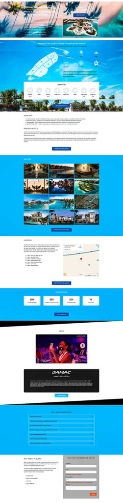
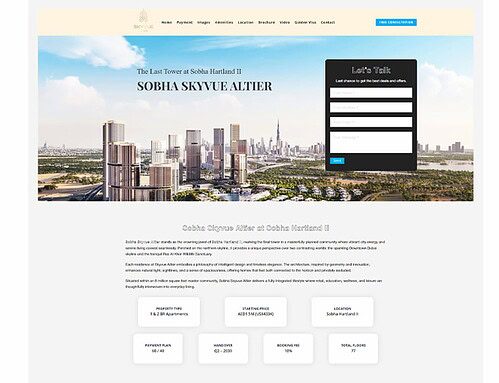
3. High-Impact Visuals: Show, Don’t Just Tell
Humans are visual creatures. A high-quality image, video, or GIF can communicate your offer’s value faster than text ever could.
Hero Shot: Use a high-resolution “hero shot” that shows your product or service in context. If it’s software, use a clean screenshot or a short demo video.
Human Connection: Images of real people (not generic stock photos) can significantly increase trust and relatability.
Video Content: A short, engaging explainer video (1-2 minutes) can boost conversion rates by clarifying your offer and building a stronger connection with the visitor.
4. The Unmissable Call-to-Action (CTA)
The Call-to-Action (CTA) is the most critical element on the page. It’s the button that turns a visitor into a lead.
Action-Oriented Language: Use strong, specific verbs. Instead of “Submit,” try “Get Your Free Ebook” or “Book My Free Consultation.”
Contrasting Color: The CTA button should be the most visually prominent element on the page. Use a color that stands out from the rest of the design.
Strategic Placement: Place your CTA “above the fold” (visible without scrolling) and repeat it further down the page for longer landing pages.
5. The Lead Capture Form: Keep it Simple
Your lead capture form is where the conversion happens. The golden rule here is to only ask for what you absolutely need.
Fewer Fields = Higher Conversion: Every additional field you ask for can decrease your conversion rate. For a top-of-funnel offer like an ebook, a name and email address are often enough.
Clear Labels: Ensure each form field is clearly labeled.
Privacy Assurance: Include a short message like “We respect your privacy and will never share your information” to build trust.
6. Social Proof: Build Instant Trust
People trust other people. Social proof is a powerful psychological trigger that validates your offer and reduces visitor anxiety.
Testimonials: Include short, impactful quotes from happy clients, complete with their name, title, and photo.
Logos of Past Clients: Displaying the logos of well-known companies you’ve worked with builds immediate credibility.
Data and Numbers: Use specific numbers like “Trusted by over 10,000 businesses worldwide” or “Join 5,000+ subscribers.”
7. Mobile-First Design: Optimize for Every Device
A significant portion of your traffic will come from mobile devices. If your landing page isn’t optimized for mobile, you’re losing leads.
Responsive Design: Ensure your page automatically adjusts to fit any screen size.
Fast Loading Speed: Mobile users are impatient. Compress images and streamline code to ensure your page loads in under 3 seconds.
Thumb-Friendly: Make sure buttons and form fields are large enough to be easily tapped on a small screen.
By incorporating these seven elements, you can transform your landing pages from simple web pages into powerful lead generation machines that drive measurable growth for your business.
Frequently Asked Questions on Landing Page for Lead Generation
1. What is a landing page, and how is it different from a homepage?
A landing page is a standalone web page created specifically for a marketing or advertising campaign. Its single, focused objective is to drive a specific conversion action (e.g., submitting a form, downloading an eBook, signing up for a demo).
In contrast, a homepage is the central hub of a website, designed for navigation, branding, and presenting the breadth of a company’s offerings. A landing page’s success is measured by its conversion rate, while a homepage’s success is often measured by engagement and overall traffic.
2. What are the essential elements of a high-converting landing page?
A high-converting landing page typically contains six core elements:
- Unique Selling Proposition (USP): A clear, benefit-driven headline and sub-headline.
- Hero Shot: A high-quality, relevant image or video of the product or offer.
- Benefits and Features: Concise, scannable copy (usually bullet points) highlighting how the offer solves the user’s problem.
- Social Proof: Testimonials, client logos, or success statistics to build trust.
- Lead Capture Form: A simple, frictionless form to collect visitor data.
- Call-to-Action (CTA): A single, prominent button that instructs the user on the next step.
3. How many form fields should I include for lead generation?
The number of form fields is a direct trade-off between quantity of leads and quality of leads:
Fewer Fields (≈2−3): Leads to a higher conversion rate (more sign-ups) but often results in lower-quality leads (top of the funnel). Use for: eBooks, checklists, newsletters.
More Fields (≈5−7): Results in a lower conversion rate but higher-quality, more qualified leads who are serious enough to provide more information. Use for: Demo requests, consultation bookings, or price quotes.
Best Practice: Only ask for what is essential to qualify the lead (e.g., Name, Email, and perhaps one qualifying question like “Job Title”).
4. Should a landing page have navigation links (like a menu)?
No. A dedicated lead generation landing page should never have a main navigation menu, social media links, or external links (except for necessary privacy policy/terms links).
The purpose of the landing page is to eliminate distractions and keep the visitor focused on the single conversion goal. Any link that takes the user away from the CTA button is a potential leak in your funnel.
5. How important is mobile optimization for a landing page?
Extremely important. Given that over half of global web traffic comes from mobile devices, your landing page must be built with a mobile-first approach.
Ensure the design is responsive (adapts to screen size).
Test that the form fields are easy to tap and fill out on a small screen.
Minimize image size and scripts to ensure fast loading speed, as mobile users are less tolerant of slow pages.
6. What is A/B testing, and what elements should I test?
A/B testing (or split testing) is the process of creating two versions of a landing page (A and B) that are identical except for one single element. Traffic is split evenly between the two versions to see which one performs better.
Key elements to A/B test include:
- The Headline (Testing clarity vs. curiosity).
- The CTA Button Text (e.g., “Download Now” vs. “Get My Free Resource”).
- The Visuals (Image vs. Video).
- Form Length (Fewer fields vs. more fields).
A/B testing is essential for continuously improving your conversion rate.
7. What is a good conversion rate for a lead generation landing page?
A “good” conversion rate varies significantly by industry, traffic source, and the value of the offer.
General Benchmark: A conversion rate between 3% and 5% is often considered average across most industries.
High Performance: Top-performing landing pages can achieve conversion rates of 10% or higher, especially if the offer is highly specific and the traffic is very targeted (e.g., a dedicated email list).
Focus on continually improving your own rate rather than chasing a fixed industry number.
